Before a customer reads a word, they notice color. A bright red catches the eye on a crowded shelf. A soft blue conveys trust and calm. The choice between warm and cool colors in packaging shapes first impressions, influences brand perception, and affects competitive visibility. Understanding how these colors work — and how they align with brand identity, product category, and target audience — is fundamental to effective packaging strategy.
What Are Warm and Cool Colors in Packaging?
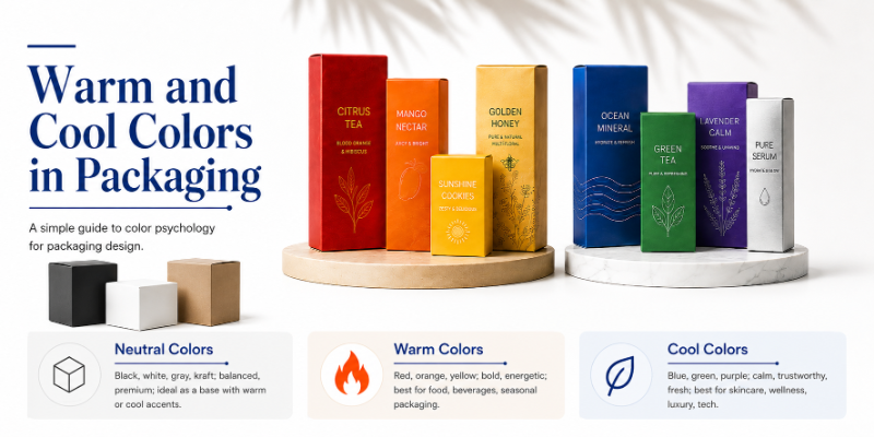
Warm colors — red, orange, yellow, and warm shades of brown and gold — feel energetic, bold, and exciting. They draw immediate attention, stimulate appetite, and create urgency. Warm colors are naturally visible from distance, which is why they dominate fast-food, seasonal, and impulse-purchase packaging.
Cool colors — blue, green, purple, and cool shades of gray and silver — feel calm, clean, and refreshing. They convey trust, wellness, and professionalism, appearing often in health products, luxury goods, and premium packaging aimed at building confidence in quality.
Neutral colors — black, white, kraft paper, gray, and beige — serve as balancing elements and work best as a foundation for warm or cool color accents.
Why Color Psychology in Packaging Matters
Color strongly influences shelf attention, first impressions, brand recall, and product comparison. When a shopper glances at a shelf, color is processed before text or imagery. This makes packaging color one of the most important design decisions a brand makes. A purple box signals luxury. A green label communicates eco-consciousness. A red banner suggests urgency or sale.
Color works best when combined with quality materials, readable typography, intentional finishes, and brand positioning that matches the color message. Bold color on cheap materials undermines the effect, while the right color on premium materials amplifies brand perception.
Warm Colors in Packaging
Red creates urgency, passion, and appetite — why it dominates fast food, energy drinks, and candy packaging. Red also signals sales and limited-time offers. In luxury contexts, red conveys confidence and power.
Orange communicates creativity, friendliness, and approachability. It is bold without aggression, working well for kids products, snacks, playful tech, and wellness supplements. Orange catches attention while feeling approachable rather than alarming.
Yellow is the most visible warm color and fastest to draw the eye. It conveys optimism and warmth, but needs careful design — oversaturated yellow on cheap materials looks inexpensive, while yellow paired with premium finishes and clean typography reads as refined and modern.
Warm colors excel for food, snacks, beverages, kids products, seasonal, and promotional packaging. The drawback: warm colors can feel aggressive or low-end if design, material, and typography are not aligned with positioning.
Cool Colors in Packaging
Blue is the most popular packaging color globally because it conveys trust, professionalism, and calm. Blue works across technology, finance, premium beverages, and health products. It is safe, familiar, and rarely alienates audiences.
Green signals nature, freshness, and sustainability. Green packaging is synonymous with organic and eco-friendly products and appears frequently in health and wellness categories.
Purple is associated with creativity, luxury, and uniqueness. Purple dominates premium cosmetics, specialty foods, and brands positioning themselves as distinctive.
Cool colors create premium, trustworthy, and natural feel. The drawback: cool colors can feel cold or distant without balance. Many successful brands pair a cool primary color with a warm accent — blue packaging with orange text or gold foil — to maintain visual warmth.
Warm vs Cool Colors: Key Differences
| Color Type | Common Colors | Emotional Feel | Best Packaging Uses | Strategy Notes |
|---|---|---|---|---|
| Warm colors | Red, orange, yellow, warm gold | Bold, energetic, exciting, appetizing | Food, beverages, kids, sales, seasonal | High shelf visibility; immediate attention |
| Cool colors | Blue, green, purple, cool silver | Calm, trustworthy, fresh, premium, natural | Health, skincare, luxury, wellness, tech, eco | Conveys quality and sophistication |
| Neutral colors | Black, white, gray, kraft, beige | Professional, sophisticated, natural, organic | Luxury, eco-conscious, minimalist, premium | Works best as base layer with warm or cool accents |
| Mixed warm and cool | Warm primary + cool accent (or vice versa) | Balanced, modern, dynamic, professional | Versatile across most product categories | Provides visual interest and emotional depth |
Color Theory in Packaging Design
Hue is the pure color — red, blue, green. Saturation is color intensity — vibrant red versus muted burgundy. Contrast affects readability — black text on white reads clearly, while light yellow on white does not. Complementary colors sit opposite on the color wheel (red-green, blue-orange, yellow-purple) and create dynamic interest. Analogous colors sit next to each other and create harmony. Monochrome palettes use different shades of one color and feel cohesive. Accent colors are small touches of contrast that highlight information.
Emotional Impact of Packaging Colors
- Red – Urgency, boldness, appetite. Use for fast-food, snacks, sales.
- Orange – Creativity, friendliness, energy. Use for kids, snacks, playful brands.
- Yellow – Optimism, visibility, warmth. Use in crowded retail with confident design.
- Blue – Trust, calm, professionalism. Use for tech, health, premium products.
- Green – Nature, freshness, sustainability. Use for organic, eco-friendly, wellness.
- Purple – Luxury, creativity, uniqueness. Use for premium cosmetics, distinctive brands.
- Black – Sophistication, premium quality, strength. Use for luxury products.
- White – Simplicity, purity, cleanliness. Use for premium, health, tech products.
- Kraft/Brown – Natural, organic, eco-conscious. Use for sustainable, artisanal products.
Brand Colors in Packaging
Packaging colors should reinforce brand identity. If your logo is navy blue and your values center on trust and professionalism, navy should dominate your palette. Consistency across packaging, website, social media, and retail displays strengthens brand recognition. Audience shapes strategy — a luxury jewelry brand and a children’s toy brand need entirely different color approaches.
Color Combinations for Packaging
Effective pairings include: red and white (bold contrast), orange and black (confident energy), yellow and blue (visible and trustworthy), green and kraft (natural), blue and white (clean and professional), black and gold (luxurious), pastel combinations (soft lifestyle), and neutral with bright accent (modern and minimalist).
Choosing Warm or Cool Colors by Product Type
Food and Beverage
Warm colors dominate to stimulate appetite. Premium brands often shift to cool or sophisticated palettes — black and gold for luxury chocolate, deep blue for specialty coffee — to signal higher positioning.
Cosmetics and Skincare
Cool colors (blues, purples) dominate luxury cosmetics. Natural and organic brands use green and kraft. Bold indie brands may use warm accents to differentiate.
Health and Wellness
Cool colors — especially green and blue — convey trust, natural benefits, and professionalism. Clean, simple design reinforces wellness messaging.
Luxury Products
Sophisticated, restrained palettes — black, white, deep jewel tones, metallics — signal exclusivity. Overuse of color is avoided.
Eco-Friendly Packaging
Green, kraft, and natural brown communicate environmental consciousness. Complementary cool accents can be added without compromising the eco-message.
Retail and Ecommerce
Retail boxes need shelf visibility, often favoring saturated colors or high contrast. Ecommerce packaging benefits from cohesive, branded palettes that photograph well for unboxing content.
How Materials and Finishes Change Color Appearance
Colors shift dramatically depending on packaging material and finish. Kraft paper has warm undertones that shift printed colors toward earthiness. White cardstock makes colors appear more saturated. Matte coating creates refined, sophisticated color. Gloss coating increases vibrancy and shine. Soft-touch coating enhances perceived premium quality. Foil stamping adds metallic accents. Spot UV highlights logos or accents.
Important: Always test color proofs on your selected material and finish before bulk production. Colors can shift significantly between screen previews and printed packaging.
Common Mistakes to Avoid
- Choosing colors based on aesthetics alone, ignoring positioning
- Ignoring target audience preferences
- Using too many colors, creating visual chaos
- Poor contrast between text and background
- Copying competitor colors too closely
- Ignoring material effects on color appearance
- Forgetting shelf visibility requirements
- Skipping physical samples before bulk production
How to Choose the Right Packaging Color Palette
- Understand your product category and competitive landscape
- Define the emotion you want to create (bold, calm, premium, playful)
- Study your target customers and their color preferences
- Review competitor packaging for differentiation opportunities
- Choose one primary color and one or two accents
- Ensure text readability with strong contrast
- Match colors with materials and finishes
- Order a physical sample before bulk production
Final Verdict
Warm and cool colors in packaging create fundamentally different impacts. Warm colors create energy and visibility — ideal for food, beverages, and energetic brands. Cool colors create trust and professionalism — best for health, luxury, and premium products. The most successful packaging color strategy aligns colors with brand identity, product benefits, target audience, material selection, and the retail or ecommerce environment.
Custom Packaging Color Support by Custom Boxes Lab
Custom Boxes Lab helps brands create custom printed packaging with strategic color palettes, quality materials, and professional finishes. Need packaging colors that match your brand and product goals? Custom Boxes Lab can help you create custom printed boxes with the right materials, color matching, printing, and finishing options.